Colors matter. Colors are a considerable part of aesthetics, and aesthetics facilitate engagement. Colors can convey meaning, guide a reader’s attention, facilitate the intuitive understanding of visualizations, and of course can help to make things look pretty.
There are two very common approaches to color. One is to look at the color spectrum in which the colored light is arranged by its wavelength like a rainbow. The other is to start with some primary colors (red, green, blue, for example) and construct other colors via color mixing. These approaches like other alternatives have distinct differences and influence how we think about color and how we represent it. What is the best system of representing and thinking about color depends highly on the editing medium (paint palettes, lamps, digital software, …), the display medium (screens, paper, …), the intended observer (humans with or without color deficiencies, honeybees, octopuses, …), and the application (artistic, informative, signaling, …). The reason that there is such ambiguity about color is that it is not purely a physical property, a wavelength, but also a property of physiological perception, psychological interpretation, and eventually subjective experience (in philosophy termed ‘Qualia’). To begin to shine some light on all this complexity, here, I will explain how color spaces work.
But First: Mixing Colors
We begin with a very basic but fundamental observation. Every color we see, we perceive as a singular individual color. Even a ‘greenish-blue’ is its own color which we merely describe by referencing other colors. We experience color in the same way, independent of whether it was mixed or presented as a single monochromatic source. We don’t actually see that this yellow is created by red and green pixels. The number of wavelengths and light sources mixed together has no influence on the color we perceive. Our eyes and brain combine the incoming wavelengths to a single color impression. This is evolution’s answer to increasing the number of perceivable colors (several million) without requiring the same amount of color-specific photosensitive cells.
Conveniently, that is also the reason why color spaces like RGB work in the first place. With only three colors, all hues of the spectrum can be recreated by mixing (why hues and not colors will be addressed later). How to mix the primary colors to get the full spectrum is described by so-called color matching functions. Why exactly 3? Humans have trichromatic vision, meaning they have three kinds of color-sensitive cells (S, M, and L cones), thus, it requires three dimensions to represent all perceivable colors.
When talking about color mixing I always mean the ‘additive’ mixing of colored light. The ‘subtractive’ mixing of colored materials is largely about the composition of the materials themselves and doesn’t follow simple rules. For example, yellow paint and cyan paint only mix to green if the yellow paint reflects a mix of red and green wavelengths while absorbing all else, and the cyan paint a mix of green and blue so that green is the only not-absorbed wavelength in the mixture. If the paint materials were to reflect single wavelength yellow and cyan their mixture would just be grayish because in the mix all wavelengths are absorbed (given that there are no chemical reactions). Thus, the ability to only perceiving a single color impression and not the wavelength contributions makes it impossible to predict the result of a ‘subtractive’ color mixing without prior knowledge of the materials, such as having watercolors that are designed to be mixed.
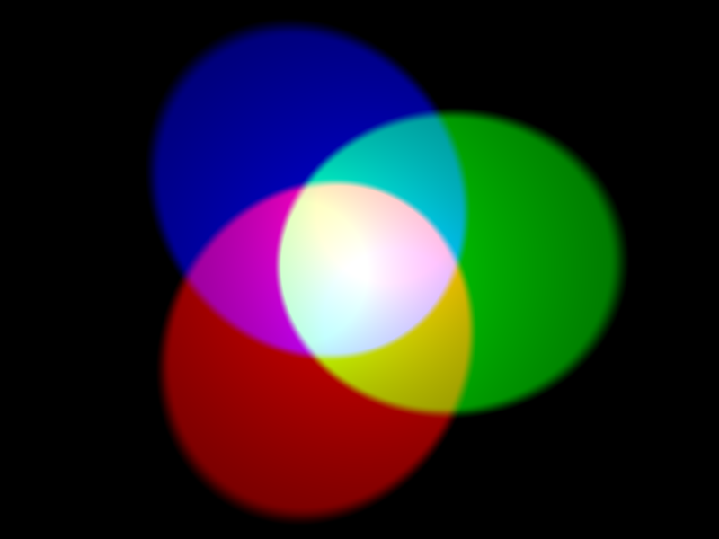
In the mixing of colored light, where clear principles can be formulated, the question of interest is which dimensions to choose to represent the colors best. As mentioned above, this depends largely on the application. Similar to coordinate transformations in physical space, choosing the adequate dimensions for the color space can make descriptions much easier to handle. Although I will go through various descriptions here, ultimately the color space should serve the designing color palettes for data visualization to be consumed by humans on screens or paper.
Fun Fact: Although not directly visible for the naked eye it is still relevant to build white light sources that cover the whole spectrum of colors because objects can of course only appear in their own color when that color is present in the light they are illuminated in. Additionally, some wavelengths also play other roles than just in color perception. Plants mostly need the red and blue wavelength for photosynthesis; the production of the sleepiness hormone Melatonin is most efficiently suppressed by particular blue wavelengths in a process independent from the retinal cones; Vitamin D production requires very short wavelengths in the UV B regime, which is however not in the visible range.
Primary Color Spaces: RGB and CMYK
As established, we can mix three primary colors according to their matching functions to represent any color in the color spectrum. The choice of primary colors to do that is in principle arbitrary. You can see an example of the color matching functions below. For each color in the spectrum on the horizontal axis, the curves indicate the mixing proportions of the primary colors. Interestingly, the red curve is partly negative, indicating that to mix the colors between $440$ nm and $550$ nm (cyan/turquoise) you would need to add blue and green and then remove some red. This is of course not possible and in consequence means that this combination of primaries can not create a pure cyan but only a somewhat reddish cyan. In fact, there is no combination of three primary colors which can mix all spectral colors perfectly, there is always some negative part in the matching functions. However, how much of the spectral color space is accurately represented in the constructed three-dimensional space does depend on the choice of primary colors and is called the gamut of the color space.
But wait, then how does the eye register all spectral colors with only three kinds of color receptors? The answer is somewhere in between “it doesn’t” and “it’s tricky”, but we’ll come to that.
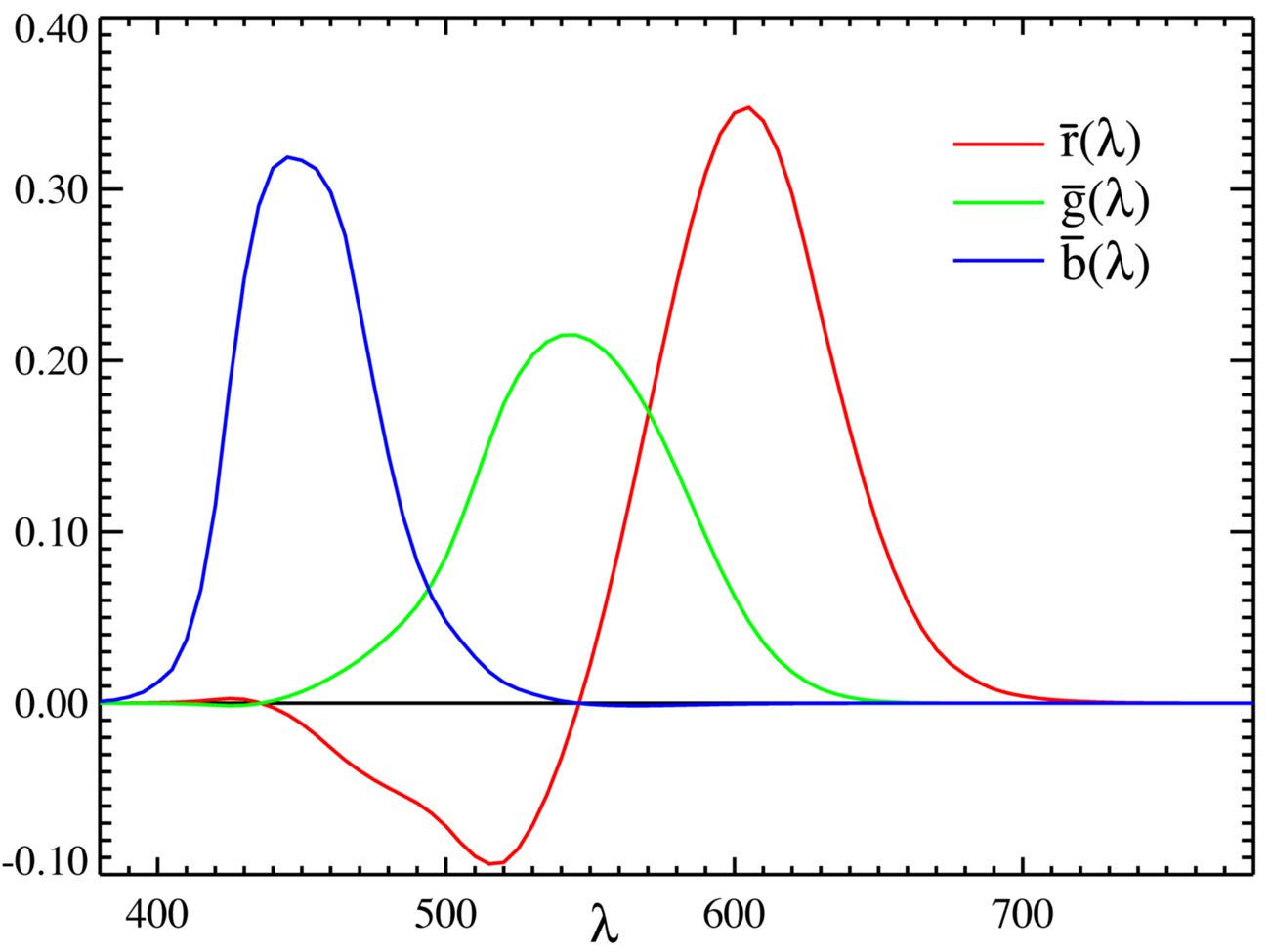
So, the popularity of RGB is not totally arbitrary but a consequence of ‘taking a color from either end of the spectrum (red and blue) and some color from the middle (green)’ yields a relatively good gamut. Nevertheless, RGB itself is not uniquely defined and there are differently optimized standards for different applications using different hues for their red, green, and blue definitions. Some examples are sRGB for most screens and Internet applications, Adobe RGB for better CMYK transformability, DCI-P3 for movie production, or Rec. 709 and 2020 for televisions. To be emphasized here, RGB is not the “natural” choice for a color space because of the red, green, blue cones on the retina. That is just not how color perception works, which will become clear when looking more closely at the physiology of the retina.
Another popular combination of primary colors is cyan, magenta, and yellow, often accompanied by black as CMYK as a color-printing standard. Having different color representations for printing than for screen display is useful because in printing the color mixing is subtractive. Overlaying color dots always adds up to darker colors, thus to get a wide range of colors lighter primary colors like CMY are better suited than the darker RGB. In screens, the pixel colors are mixed additive so that mixed colors generally become lighter, and thus here the darker RGB base can represent more colors. Black (K) is usually added to CMY to improve the printing of darker colors. Mixing C M and Y would in principle also yield black but in practice it is easier and more economic to just add black separately.
These color representations are evidently very useful and widespread. However, their appeal is mostly that they are nice to work with numerically and thus are practical for machines, they are not particularly tailored towards human perception.
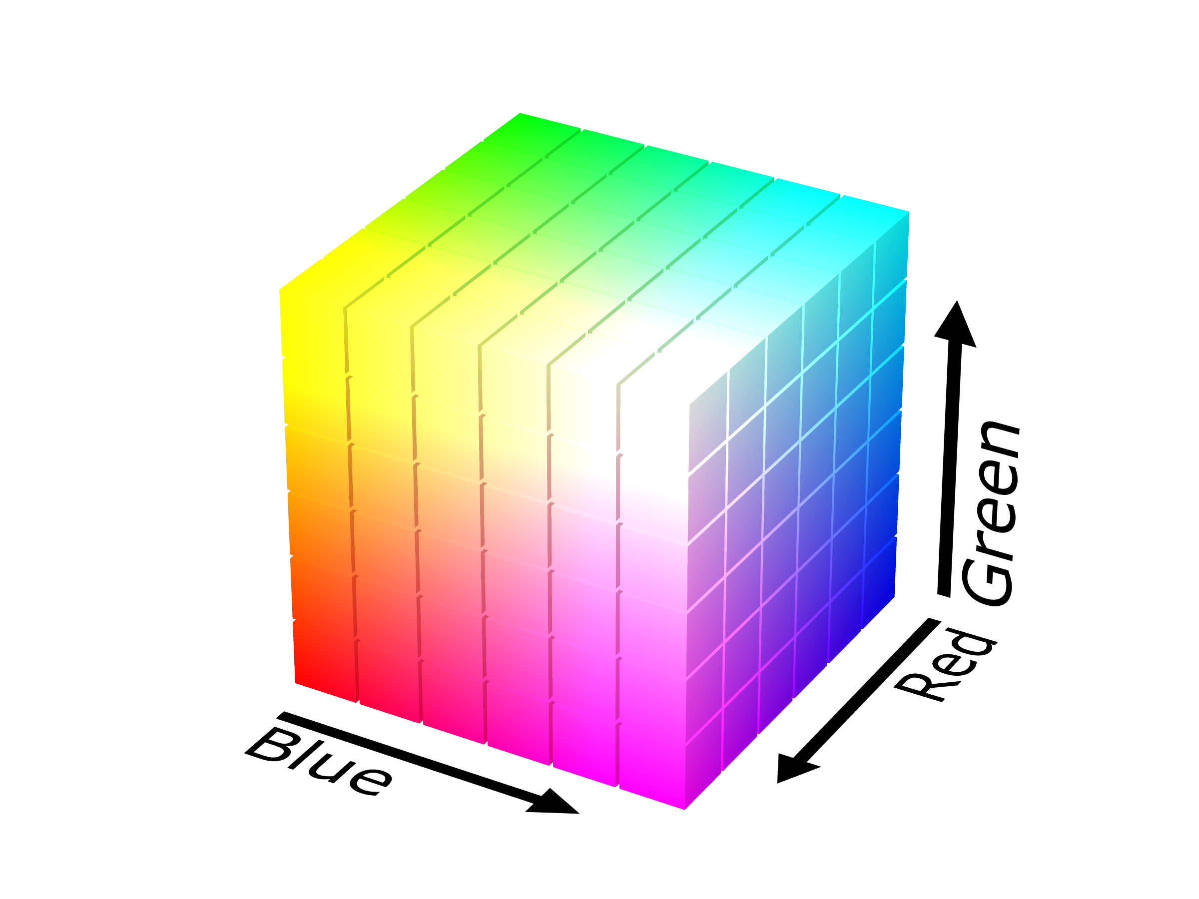
Their neat arrangement into a three-dimensional cube makes it particularly easy to define a color by a triple of color coordinates, (r,g,b) for example. The precision of the coordinate values consequently defines the color resolution. Typically, the color values range either from 0 to 1, or to avoid floating-point numbers from 0 to 255 (= 8 bits). This means that there are 256 color increments along each axis, and therefore 2563=16777216 different colors within the RGB cube. Another frequently used notation is the HEX code. A HEX code is just a different way of writing the RGB coordinates. Instead of writing a coordinate as $000$-$255$ in the decimal system, it is written as $00$-$FF$ in the hexadecimal system. Quick check: each hexadecimal digit can take 16 different values (0-9 & A-F), so a pair of digits can represent 162=256 color increments so that the HEX notation #RRGGBB is exactly equivalent to the (r,g,b) coordinates.
Fun Fact: The gamut describes the collection of colors which can be displayed within a color space. The term gamut, however, was first used to describe the starting point of a musical scale. Gamut is the shorthand for gamma ut, where ut denotes the first tone in the sequence of syllables traditionally representing the basic tones: ut, re, mi, fa, sol, la. These names for the tones come from a short melody written by Paulus Diaconus in the first century to praise John the Baptist. In his six verse piece, these phonemes are the first syllables of every verse. So, when a display advertises itself that it can display many colors, thus being ‘wide-gamut’, it derives the name partly from a single piece of poetry of an Italian monk 2000 years ago.
There actually seems to be some relation between musical tones and colors. But rather via a cross-association of emotion (Palmer et al. (2016) “Music-to-Color Associations of Single-Line Piano Melodies in Non-synesthetes”, Whiteford et al. (2018) “Color, Music, and Emotion: Bach to the Blues”)
The Color Wheel: Hue
So far I addressed color, or more precisely its hue, as a linear property, like it is presented in the spectrum. Besides tints, tones, and shades of color, the hue describes the kind of color and is what we refer to by the color names red, green, blue, yellow, or pink.
Astonishingly enough, the hue is perceptually not linear but circular. This means that the far ends of the visible spectrum red and violet are actually perceptually very close. This feature of perception was first discovered by Isaac Newton and described in his 1704 book Opticks. He arranged the colors on a wheel, indicating seven principal colors in the analogy of the spacings between the notes in the Dorian musical scale. This color theory was further developed and challenged by many famous physicists and philosophers over the following centuries, for example, most critically by Johann Wolfgang von Goethe in his 1810 book Zur Farbenlehre.
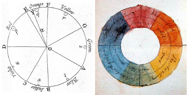
The color wheel is used to illustrate the mixing of color. Colors opposite from each other on the wheel are complementary pairs that mix to white. Similarly, any straight line within the wheel represents the mixing of two colors in various proportions. This linear relationship was later formalized as Grassmann’s law in 1853. Taking into account these insights, the question now is of course: how to reconcile the circular nature of hue with the 3D cube structure of the RGB space?
Fun Fact: While Newton and Goethe took very different approaches to color theory, analytical mathematical versus impressionistic empirical, they both agreed to the circular arrangement of colors. Newton divided his wheel into 7 main colors and associated them with tones in the musical scale. Goethe split his wheel into 6 colors and associated them with aesthetic qualities. Furthermore, Goethe thought of darkness as the opposite and not as the absence of light, and spectral colors as the interaction between light and dark and not as components of white light. (see Dennis L. Sepper “Goethe Contra Newton: Polemics and the Project for a New Science of Color”)
Cylindrical Color Spaces: HSL, HSV, HSB, HCL, …
The RGB space (or any primary color space) does not only contain the range of hues for which the mixing proportions equal the coordinate ratios in the 3D space (r,g,b). It does also contain a degree of color lightness ranging from black in one corner (0,0,0) to white in the opposite corner (1,1,1). Additionally, there is a degree of colorfulness or saturation ranging from shades of gray along the central diagonal of equal rgb proportions to the pure colors at the corners: red (1,0,0), green (0,1,0), blue (0,0,1), yellow (1,1,0), magenta (1,0,1), and cyan (0,1,1).
Using these arguably more intuitive dimensions it is possible to construct an alternative color space that also respects the circular arrangement of hues. Thus, arranging the circular hue as circumference, the linear saturation as radius, and the linear lightness as the height axis creates the cylindrical color space HSL.
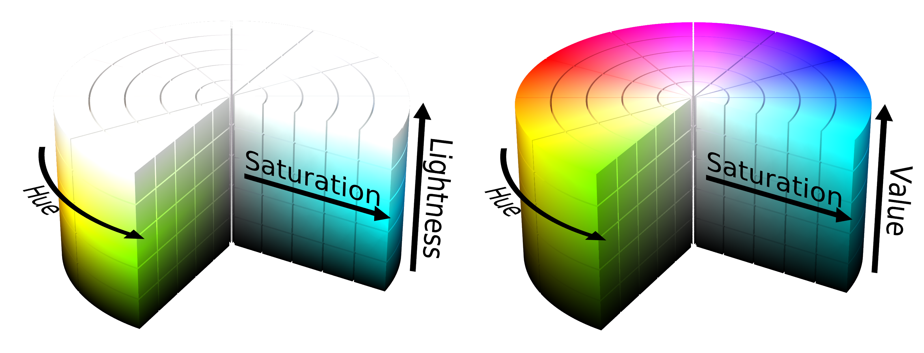
The extravaganza of cylindrical color spaces doesn’t stop there, in fact, it has just begun as there is a wild zoo of alternative parameterization. Instead of the lightness describing the mixing with black (shades) and white (tints), the value only describes the shading of the color. This alternative representation still covers the same gamut (amount of colors) of colors since the tinting can also be achieved by varying the saturation of the pure color (on the HSV cylinder moving inward from the top edge with V=1). Other alternatives to the lightness or the saturation parameter include brightness, intensity, and luma. Brightness and value are typically used equivalently, and luma is similar to intensity, just with an additional correction for the fact that we can make finer distinctions between darker colors than brighter colors. Likewise, the saturation is sometimes replaced by the chroma, as shown in the figure below. This might be considered more intuitive since it resolves the ambiguity that there identical blacks and whites (only in HSL) for every level of saturation. In the alternative conic or bi-conic geometry only the pure colors have a maximum chroma.
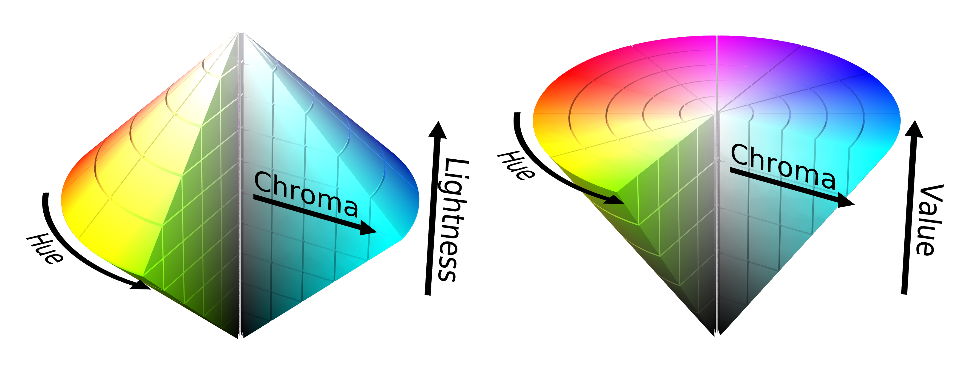
Wait, wasn’t the cylindrical spaces supposed to make the color space more intuitive? Now, there are a bunch of new parameters that are not even consistently defined. Instead, this easily leads to more confusion as different software use different variations and transitioning from one to another may introduce unwanted color shifts. Besides using different color spaces, there is also a wide array of visual representations of these spaces for color picking and each software seems to invent its own combination of scales, maps, and arrangements, obfuscating the slight differences in the color spaces even more. It also doesn’t help that the terms lightness, brightness, intensity, chroma, luma, etc. are often used with varying meanings that a standard user can’t possibly keep track of.
So, what are the actual advantages of these color spaces? Their main selling point is that they are computational effective (compared to more complex models). The circular representation of the hue makes sense perceptually, but the resulting discontinuity in the angle coordinate may lead to some numerical difficulties. Importantly, it needs to be noted that the cylindrical color spaces are not absolute spaces. They are defined only in reference to an RGB space, which is also not uniquely defined as we know. Hence, this means that they suffer from the same problems as RGB spaces, and therefore also cannot cover the full range of possible colors.
The attempt of HSV, HSL, and friends to relate to better relate to the dimensions of perception actually leads to more confusion than it is helpful. Besides the tricky terminology, the dimensions of the color cylinder are also confounded. As already indicated above by the ambiguity between cylinders and cones, the saturation scale also contains varying degrees of lightness. Naturally, we even perceive the hues of different pure colors as different amounts of lightness.
In conclusion, cylindrical color spaces offer no real advantage over RGB, especially since they need to be converted back to RGB (for the screen) or to CMYK (for print) anyway. Thus, they are still mostly practical for machines but not very useful for humans. In the words of color expert Cynthia Brewer: “These flaws make the systems difficult to use to control the look of a color scheme in a systematic manner.”
Fun Fact: Just as most sensual perception, the light intensity is perceived approximately on a logarithmic scale which enables us to manage a wide range of stimulus strengths from dim night to bright sunshine (see Weber-Fenchner law or Steven’s power law). This means that the human eye can rather distinguish relative differences between darker then lighter tones. This property is exploited by the so-called Gamma correction in image encoding to optimize the image size and quality.
Color Perception via Rods and Cones
To understand what makes a color space more suitable and intuitive for humans, we need to understand more about color perception. Humans are trichromatic, meaning that they have three types of color-sensitive cones. This feat is shared only with some other primates, most other animals are mono- (e.g. marine mammals), di- (e.g. land mammals), or tetrachromatic (e.g. fish, reptiles, and birds). Mantis shrimps have 12 different cone types but use them in a totally different manner. Our three cone types are sensitive to short, middle, and long wavelengths of the light spectrum, respectively, and are thus called S, M, and L cones. Sometimes, they are also referred to as blue, green, and red cones. This is, however, misleading as the sensitivity of each cone stretches over multiple colors, and even if identified by their peak-sensitivity the L cone rather corresponds to yellow than red, as you can see in the absorption curves below.
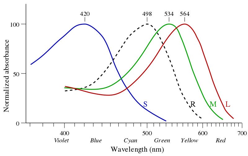
An eye-catching property of the absorption curves is that they are covering the visible spectrum in a very non-uniform manner. The absorption of the M and L cones overlap a lot and mainly cover the green-yellow wavelengths while the absorption curve of the S cones is far off at the blue wavelengths. This feature already hints at the fact that the perceived lightness of a color can differ depending on the hue. For example, a pure yellow, close to the peak sensitivity of both M and L cones, appears brighter than a pure blue, which is only detected by the S cone. The perceived retinal color impression is therefore determined by cone absorption curves along with the spectral power distribution.
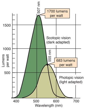
Besides the sensitivity of the cones the figure also shows the absorption properties of rods, yet a different kind of retinal receptor. Let’s have a small detour and talk about rods. Rods are light-sensitive but don’t contribute to our color vision. In fact, during normal daylight vision the rods are not contributing at all. However, when we go, for example, down into the dark basement our eyes need to adapt to the darker surrounding and we switch from using the photopic vision using cones to the scotopic vision using the rods. Since there is only one kind of rods we can’t differentiate between colors in scotopic vision and only detect varying degrees of lightness, a world in grayscale. Any slight color impression we anyway might have in such dark environments are mostly interpretations of our brain which expects certain objects to have certain colors. In the daytime photopic vision, the overall wavelength sensitivity is maximal in the green-yellowish regime. The sensitivity of rods is also a function of the wavelength which however has its peak at a smaller wavelength around cyan-green. In low-lit surroundings, we can also adopt a mix between the cone- and rod-dominant activity (mesopic). Because of the different sensitivity peaks of rods and cones, in this mesopic state, the sensitivity peak lies between the two. This means that during twilight as the environmental brightness slowly vanishes the maximum sensitivity of our eyes shifts from green towards blue (Purkinje shift). Thus, with varying brightness in our environment also our color perception is shifted. To make things even more complicated the perceived color impression is also dependent on where in the field of view a stimulus is presented. This is because the density of cones is not the same over all the retina, and around the fovea (the central focal point of the retina) the cones are most densely packed.
Now, how can knowing about the absorption functions of the cones help to construct better color spaces? You might have noticed, that the absorption curves are somewhat similar to the color matching functions introduced earlier. In both scenarios, the functions indicate how to mix three different sources for a defined color impression. In the case of color matching, the sources are the three primary colors and in the case of the retina, the input is the neural activity of the different cones. As illustrated earlier, a major drawback of the primary color spaces is that they can’t represent all visible colors because for any set primary colors some part of the matching functions will be negative and thus represent a color that is impossible to mix. Since we are associating the color matching functions with the absorption curves, what would be the corresponding primary colors of the S, M, and L cones which somehow allows us to mix all colors?
The answer is impossible colors. The primary colors corresponding to the M cone, for example, would be probably considered greenish since that’s where the M cones have maximum sensitivity. However, this primary-M-cone-green can never be seen or realized because every color always activates a combination of S, M, and L cones. No color can exclusively activate only one type of cones. Even though impossible colors do not actually exist, they can be described mathematically and ultimately used to define color spaces.
Fun Fact: As illustrated in the diagram of spectral absorption, the M and L curves are very close together. Why is that? Why are they not evenly spaced over the visual spectrum? Studies suggest that this asymmetry yields real evolutionary benefits. The increased sensitivity in the green-yellow regime appears to be helpful to evaluate the ripeness of fruit (Regan et al. (2001) “Fruits, foliage and the evolution of primate colour vision”). Additionally, this might even be helpful to detect subtle social cues such as cheeks blushing with a red hue (Changizi et al. (2006) “Bare skin, blood and the evolution of primate colour vision”).
CIE Chromaticity Diagram
From the absorption curves of the retinal cones, we now know that the trick to constructing a complete color space is to start from impossible colors. Or rather, that means that the exact choice of the primary colors is not of interest. Instead, we can directly define the color-matching functions in a way that the color space has favorable properties. This is exactly what the people from the CIE did, the Commission internationale de l’éclairage. In 1931, this international commission set out to establish a new standard to represent color in a perceptually reasonable way and finally bring some order to the chaos of confounded colorimetry. The result was the formidable CIE 1931 chromaticity diagram. Although there were slight revisions in 1960 and 1976, the original 1931 version still remains widely used.
The CIE color space is based on the three color-dimensions simply named X, Y, and Z. These are the (impossible) primary colors. The color matching function for Y is chosen to resemble the perceived luminance (measured in candela/m2) of human vision. The X and Z matching functions are then defined to cover the red and blue regimes of the spectrum without containing negative values. For calibrating the color matching functions they use the so-called standard observer which refers to the color impression within the very central view field within 2 degrees around the fovea at a standardized illumination.
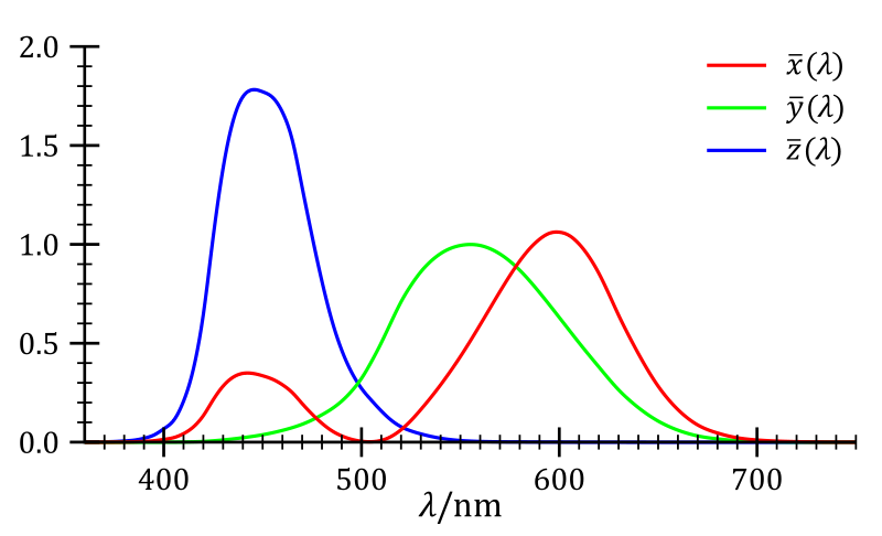
The three-dimensional color space $XYZ$ now contains all the perceivable colors. However, in this space, the perceivable colors are arranged in a not very practical, wonky shape that resembles a pancake in mid-flip. Therefore, the colors are further projected. First, onto the unit plane where $X+Y+Z=1$, and from there onto the $xy$ chromaticity plane, so that finally
$x=\frac{X}{X+Y+Z}$, $y=\frac{Y}{X+Y+Z}$, $z=\frac{Z}{X+Y+Z} = 1-x-y$.
This has the advantage that all hues can be represented in 2D with only the $x$ and $y$ coordinates. Since $z$ is a function of $x$ and $y$, it doesn’t contain any additional information and can be left out. The construction $x+y+z = 1$ essentially normalizes out any notion of color intensity so that with only $x$ and $y$ there are no shades or tints. Thus, the luminance Y is added again as the third coordinate. The resulting color space is called the CIE xyY chromaticity diagram.
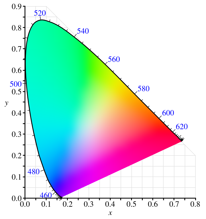
In contrast to the primary and cylindrical color spaces, this color representation now exhibits a whole array of fascinating and useful features that actually reflect our color perception. Let’s go through them. The contour line of the horseshoe-shaped color area is called the spectral locus and contains all the pure colors, meaning colors that can be attributed to a single wavelength given the luminance level. This arrangement might remind you of a deformed version of the color wheel. A crucial difference to the color wheel is that the spectral locus is not a closed circle, which is inevitable because mapping the linear dimension of wavelengths onto a circle creates a discontinuity. However, our brain resolves this jump between the shortest blue wavelengths and the longest red wavelengths elegantly by just inventing some new hues. This arrangement of the non-spectral pink, magenta, and purple colors is called the purple line. Let that sink in for a moment: there is no pink in the rainbow. These hues are just the unique impression we get from a mixture of red and blue colors. Just as mapping the linear progression of the calendar time on the spherical earth inevitably creates a point where it’s Monday first, mapping a linear spectrum onto our circular perception of hue creates the purple line. If you will, pink is the international date line of colors.
The area encompassed by the spectral locus contains all the visible colors. However, the outside of the area is of interest as well because that’s where all the impossible colors lie. Those which are not visible by themselves but which can via color mixing help software tools to access a wider array of colors.
One of the main objectives of color spaces, which already Newton attempted with his color wheel, is perceptual uniformity. In a perceptual uniform space, the euclidean distance between two points is proportional to the perceived difference between the corresponding colors. This also entails that mixing two colors will always result in a color that lies on their connecting line. To be noted, in the chromaticity diagram these features still do not work absolutely perfectly. For example, the uniformity prevails better for nearby colors as for very distant colors.
The diagram also neatly contains the color of natural light sources. Glowing heat sources emit very characteristic light, and for idealized heat sources, the color of the emitted light depends only on its temperature, the so-called black-body radiation. In the chromaticity diagram, these colors lie on the Planckian locus arranged by their color temperature. The Planckian locus ranges from a reddish oh-god-please-don’t-touch hot of about $1000$ Kelvin to a blueish will-literally-vaporize-you-when-you-come-close freakin’ hot of $10 0000$ Kelvin and above. The lines crossing the Planckian locus in the image below are isothermal lines which help to identify the color temperature of the surrounding near-white colors. Since we usually don’t interact with glowing hot objects that are thousands of Kelvins (or Celsius), it is not too surprising that the color temperatures do not correspond to our intuitive impression of color warmth. In common terminology, we rather speak of red as a warm color and blue as a cold color even though blue has a higher color temperature.
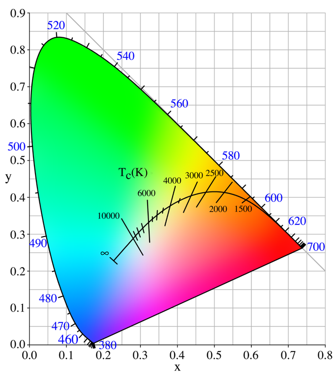
Another nifty feature the CIE people sneaked into the construction of the diagram is that white, the perfect white you get from a uniform mixture of all the wavelength, is located at exactly $x=\frac{1}{3}, y=\frac{1}{3}$. Although, without a prism, we couldn’t tell how many wavelengths or colors are mixed. Any two colors for which the connection line runs through the white point can be mixed into the same white. These are then called complementary colors. However, what we perceive as white in real life highly depends on the light source, and the typical daylight doesn’t have a flat spectrum and is not perfectly white. Daylight also varies depending on the time of day, the season, as well as the local, and geographical location. This is where the CIE swoops in again and offers a helpful definition of the standard daylight: D65. Nowadays, D65 is used by most screens as the default white point. Unintuitively, the D doesn’t stand for daylight but is just the consequence of the letters A to C already being used by previous standards. The 65 is short for $6500$ Kelvin, the correlated color temperature (CCT) of this white point. Although, since 1968 the CCT of D65 has shifted to $6504$ K because in that year the second radiation constant of Planck’s black body radiation law was officially adjusted from 0.014380 to 0.014388 which slightly shifted all the CCTs.
The above depictions of the CIE color space focus only on the $xy$ plane. The third dimension $Y$ is typically not displayed, as Y is designed to represent the luminance the colors along this axis are just brighter or darker variations of the same hues. The derived dimension $y$ is not directly proportional to $Y$ and therefore not directly interpretable as a ‘relative luminance’ measure. However, the fact that the top peak of the CIE diagram with the largest $y$ values contains the green colors is coherent with the perceptual characteristic that under equal illumination humans perceive green colors as brighter than others.
Having all these perceptual features integrated into the representation makes it very elegant, however, the xyY color space is not perfect. Thus, the CIE introduced newer variation to the chromaticity diagram in 1976, CIELUV and CIELAB. Both are transformations of the xyY color space which in particular further improve the perceptual uniformity. Talking about perceptual uniformity, you might have wondered why some larger areas in the diagram display basically the same color. For example, why do slightly different hues of green cover about the same area as all the yellows, oranges, and reds? This is not only due to an imperfect perceptual uniformity, but largely an effect of the screen displaying the image. As stated before, different applications and display mediums may use different color spaces so that transformations between them is often required. For example, most LCD screens use the sRGB space to display colors, when the same colors are then printed they are transformed into the CMYK space where they might look slightly different because there is not an exact mapping between the color spaces. In fact, most color spaces don’t even cover all colors but only a subset, they have a smaller gamut.
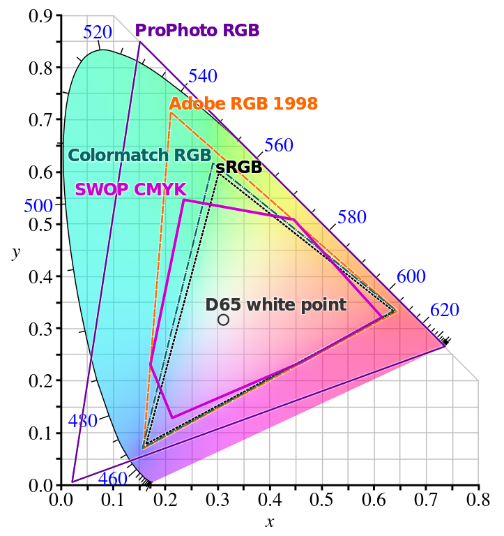
As you can see in the above image, spanning a triangle containing all colors would require the corner points to be defined outside the spectral locus, in the realm of the impossible colors. ProPhoto RGB does this, but to the determent that the increased gamut requires more resources to represent the color coordinates in the same resolution while parts of it are essentially wasted on non-visible colors.
So what is the CIE xyY color space good for when colors are anyways potentially changed by display or print? Although, not all available colors are preserved it is very helpful in constructing good color gradients, palettes, or combinations. Requirements for palettes, such as having perceptually equidistant colors and a linear change in luminance are automatically fulfilled by constructing a simple straight line with equal length parts in xyY coordinates. To check by yourself whether a xyY color is accurately displayed in sRGB you can apply the corresponding transformation on the coordinates. When the resulting coordinates become negative the color is outside the color space. In this Jupyter Notebook, I wrote down the forward and backward transformation as Python functions.
Fun Fact: Besides impossible colors, there are other color perceptions that are arguably not within the common color space. Fatiguing certain color pathways can cause strange impressions of ‘chimerical’ and ‘forbidden’ colors. Not to be confused with fictional colors.
Part II: Color Palettes and Perception - There is Gold at the End of the Rainbow coming soon
As there are is a lot more to explore about colors I will continue by focusing on how understanding color perception can help to build better color palettes for data visualization.