Do you ever find yourself wondering why is a rabbit like a spectrogram?
Signal processing and analysis is common practice in many disciplines. Basically, any data varying continuously over time can be represented as an analog signal. However, representing data as a function over time is only one way to look at it. A totally equivalent way is to represent the data in the frequency domain instead of the time domain, meaning instead of describing when the data values change you can equally describe with which periodicity the data values change. Although the representations in the time and the frequency domain are in principle equivalent, some features of the data are only clearly recognizable in either one or the other. Hence, from time to time it can be useful to stretch them thinking-in-frequencies muscles. So, for my next trick I’m going to take a white rabbit from the frequency domain and let it disappear in the time domain only to recover it back again into frequency domain unharmed. And to not hide any of the Fourier magic, I’m going to do it step by step.
From Image to Spectrum
# Python 3.8.3
from PIL import Image  # 7.1.2
import numpy as np  # 1.18.5
import scipy  # 1.4.1
import matplotlib.pyplot as plt  # 3.3.1
from matplotlib import gridspec, mlab

image = Image.open('white_rabbit.png')
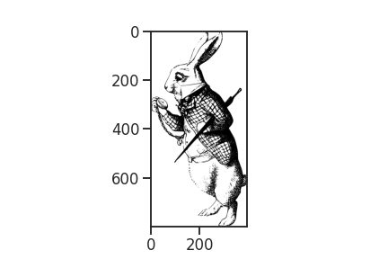
Here is our rabbit. Look! He is already late. Let’s get going and climb into that rabbit hole.
This rabbit lives in the frequency domain in the sense that we interpret each vertical pixel line as a series of Fourier components. First, to better handle the pixel values, we transform the image to an array and rotating it by 90 degrees. In this step we also discard all the color from the image’s pixels (R,G,B,A), keeping only the greyscale information (A, alpha). Fortunately, the white rabbit hasn’t much color lose here.
# creating a grayscale array by selecting the alpha value of the image
image_array = np.array(image)[:,:,-1]
# flipping the image to its side
image_array = np.rot90(image_array, axes=(1,0))
print(f'Image dimensions in pixels: {image_array.shape}')
Image dimensions in pixels: (394, 800)
From the shape of the image, we see that we are dealing with 800 distinct frequencies on frequency axis, and 394 separate spectra, while the grayscale values act as the corresponding frequency component strength, indicating how strong each frequency contributes to the time-signal.
column = 200
fig, ax = plt.subplots(figsize=(9,3))
ax.plot(image_array[column], c='k')
ax.set_xticks([0,image_array.shape[1]])
ax.set_yticks([0,255])
ax.set_xlabel('vertical pixel position ~ frequency')
ax.set_ylabel('grayscale \n ~ frequency power')
ax.set_title(f'column {column}')
From Spectrum to Time Domain
To get from the signal in the frequency domain to a signal in the time domain, we can simply apply the inverse Fourier transform. Given that the frequency description depicts a signal that is rhythmic in time, the transformation can generate time series of arbitrary length. However, in order to later resolve all the 800 frequencies accurately the transformed signal must at least have twice as many sample points. This is due to the ruling of the red queen (or in some parts also known as Nyquist-Shannon sampling theorem), which clearly states:
“[..] to permit thyself to separate between X frequencies, there shall be at least 2*X sample points. No more, no less! Well… or more.”
Otherwise, the head of our rabbit image will be quite literally cut off.
num_samples = image_array.shape[1] * 2
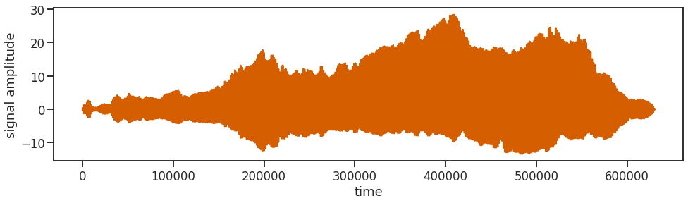
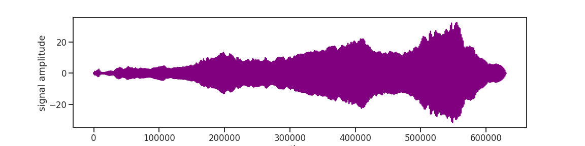
After applying the inverse Fourier transform to all the 394 spectra, we string them all together one after the other into one long image_signal. And out of good habit we are also throwing in some z-scoring.
image_signal = np.fft.ifft(image_array, n=num_samples, axis=-1, norm=None)
image_signal = image_signal.flatten()
image_signal = scipy.stats.zscore(image_signal)
image_signal.shape
(630400,)
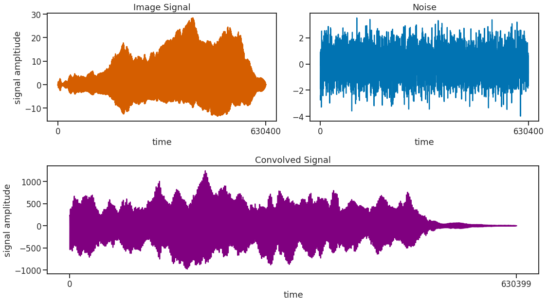
Adding Noise
To prevent things from being boring and to make the signal look more realistic, let’s add some noise to the (tea) party! Noise, just like tea can come in many colors, like brown, green, pink, or chamomile. In any case, noise is just another signal and as we know some signal features are only really visible either in the frequency or the time domain but not the other. So, to not not disturb the rabbit in the frequency domain, we add the frequency-neutral kind of noise, the one with plenty of milk and two spoons of sugar: white noise.
An approximate white noise can be generated by just drawing random numbers. Here, we further want to adjust the noise a bit to the scale of the signal. Therefore, we further smooth it with a Gaussian kernel of some width. The time? The time! It’s 5 to 12, too late, too late, too late!
noise_sigma = 5*12
noise = scipy.ndimage.filters.gaussian_filter(np.random.rand(len(image_signal)),
                                              sigma=noise_sigma)
noise = scipy.stats.zscore(noise)
While it is still warm we then convolve the noise with our image signal, generating a more realistic looking signal while leaving the frequency features quasi unchanged. Convolving a signal with white noise in the time domain is equivalent to just adding an offset to the signal in the frequency domain. Or generally stated, the Fourier transform of a convolution of two signals is equal to the product of the individual Fourier transforms. This feature is used exactically by the function fftconvolve() to speed up the computation by doing Fourier transform -> Multiplication -> Inverse Fourier transform instead of the more computationally convoluted convolution procedure of convolve().
In case the resulting signal looks a bit weird and not entirely like itself, it can be beneficial to inverse the image signal before convolving to get rid of some artifacts in the convolved signal. Afterwards, of course it needs to be reversed back into the right order so that it starts at the beginning and when it is finished, it stops.
# signal = np.real(np.convolve(noise, image_signal[::-1], mode='full'))
signal = np.real(scipy.signal.fftconvolve(noise, image_signal[::-1], mode='full'))
signal = signal[:int(len(signal)/2)][::-1]
I have an excellent idea, let’s change the subject.
Filtering
When you get lost in all the various frequencies, filtering is a great way to find your way back. Or, for example, when you realize that adding a Gaussian filter to a random noise signal makes it not white anymore and instead adds low frequency components that grow taller and taller. So, as a radical measure filtering can get rid of them again. There are all kinds of practical considerations for filtering a signal, but here, for better or worse, we take of a bite of the layman’s handbook and choose the popular butterworth filter. Butter, oh? Ah, thank you, butter!
Applied correctically, the filter will make the unwanted frequency components small. The filter function may be a bit confusing but when you read the documentation, the directions will directly direct you into the right direction.
Fs = num_samples
Fn = Fs/2
highpass_frequency = noise_sigma

b, a = scipy.signal.butter(N=4,
                           Wn=highpass_frequency/Fn,
                           btype='highpass')
signal = scipy.signal.filtfilt(b=b, a=a, x=signal)

signal = scipy.stats.zscore(signal)
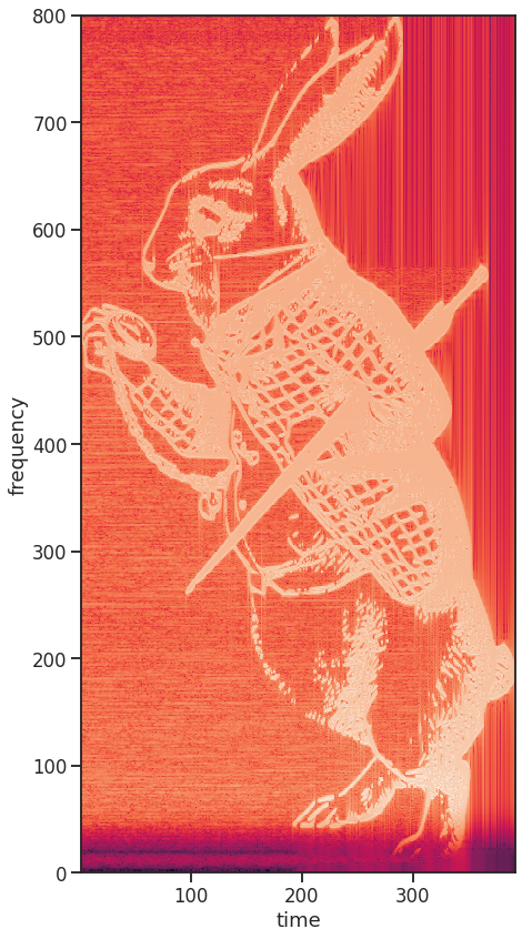
The Spectrogram
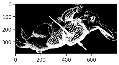
Now, to reveal the rabbit hidden in this signal, we compute its spectrogram. A spectrogram in principle just applies the Fourier transformation on a sliding window for a time resolved frequency analysis. So, by choosing the window size to be the same size as the encoded image columns, plus-minus some overlap, the spectrogram is an exact representation of the initial image. However, to be fair, it looks a bit like it had been repeatedly printed and scanned again for a worrying amount of times.
spectrum_temp, spectrum_freqs, spectrum_times = mlab.specgram(signal,
                                                              NFFT=num_samples+200,
                                                              noverlap=200,
                                                              Fs=Fs)

fig, ax = plt.subplots(figsize=(7,7*image_array.shape[1]/image_array.shape[0]))
ax.pcolor(spectrum_times, spectrum_freqs, np.log(spectrum_temp))
ax.set_xlabel('time')
ax.set_ylabel('frequency')
Now, the only thing left to do is to try if this works as well with the March Hare.