There is a quote about visualizing data. Although I don’t remember where and in which context I read it, and I don’t know who is to be credited (Apologies!), the quote stuck with me. It was something like ‘If you can not visualize an effect with an appropriate figure, you can not find an significant effect with data analysis’.
One the one hand, I find this idea humbling in the face of the sheer number and sophistication of the existing statistical methods. On the other hand it spawns the follow-up question: what is the appropriate figure?
And what if you don’t know about an effect beforehand; how does the data visualization equivalent of an exploratory data analysis look like?
Even though, I’m not sure these questions are to be actually answered, they are inspiring me to dig deeper into visualizations, to adapt, refine, and revise. So, recently I started experimenting with ways of visualizing the many-faced properties of cortical wave dynamics. And I thought it might be fun to note down some of my thoughts along the way.
The code is open-source, the dataset open-access, and the visualization is replicable.
Code repository | Data repository
About Cortical Waves
Much of the communication between neurons happens via propagated action potentials. However, there are also continuous electric potentials all around the neurons, and especially their low frequency components appear to be relevant for various aspects of brain function.
Different frequencies correlate to different types of brain states and activity and are thus organized into regimes. For example, oscillations in the Beta range (~12-25 Hz) can be associated with movement planing; the Alpha range (~8-12 Hz) is thought to relate to memory formation and consolidation; the Theta range (~4-8 Hz) is often studied in relation to attention; and the Delta range (~1-4 Hz) is assumed to be related to decision making.
Yet, the phenomenon of oscillatory and wave-like neural signals is immensely complex and the underlying mechanisms remain unclear.
Even on a purely descriptive level, the rich dynamics of neural oscillations are challenging to capture in a coherent picture. There are complex interactions between spatially separated signal sources as well as between their frequency components. Such interactions, for example, give rise to a variety of propagating wave patterns that are observable in the amplitude and the phase of the neural activity.
Initial Thoughts on Visualization Aspects
Frequency
A very common plot for frequency analysis is the spectral power distribution, which essentially shows the contributions of different frequencies to the overall signal. The spectral power distribution has a natural 1/f shape, thus, showing high power for low frequencies and a decay towards higher frequencies. The interesting aspects, however, are often peaks which occur on top of this slope, more than the absolute height of the peak. Therefore, are logarithmic scale is very handy here. Because, of the distinct frequency regimes introduced above it makes sense to segment the signal into these regimes and show them side by side.
Space
I played around with the analysis and visualization of waves in cortical space before. Here, I could try something new which is not often done when creating visualizations for pure analysis purposes: interpolation. It not used extensively, because it introduces additional assumptions and may introduce artifacts. In the best case, interpolation cleans the data representation and emphasize the dynamics of the signal, but in the worst case it obfuscates signal properties and makes it difficult to judge what of the observed is due to the actual signal and what due to the interpolation. Therefore, the initial visualization and analysis should always be without interpolation.
Furthermore, to visualize wave dynamics in space it is usually easier to directly look at the phase instead of the amplitude. The phase waves are better visible and are less disturbed by outliers and noise.
Time evolution
Plotting a signal on a time axis is probably the most common thing to do and thus extremely intuitive to read. However, this only shows one aspect of the signal evolution, typically its amplitude. The other aspect of interest here, spatial arrangement and frequency components do also evolve with time. To capture this the most “natural” way is to map the time dimension onto real time and animate the figure. The mapping can’t be 1-to-1 here, but needs to be slowed down a bit for readability. One consequence is that the plotted time axis is no longer static but also changes in time. So instead of fixed time points it now rather indicates distances into the past and the future, which need to be marked differently than the the typical time stamps.
Arrangement
The major challenge here is to bring these aspects together within one visualization that illustrates their relations in an intuitive and reasonable way. Having these different aspects and their interconnections yields the risk of just appearing confusing. Thus, the visualization should hide unnecessary complexity and needs to carefully choose where to show and emphasize it. For example, where is it more helpful to show individual channels and where is it sufficient to only show the channel average, maybe together with a notion standard deviation?
The First Attempt

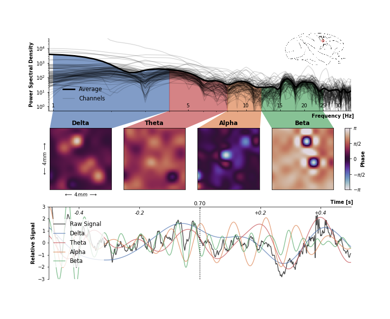
This is what I got after wrestling with matplotlib for an afternoon. It somehow works and includes most of the ideas I had going in, but there are a couple of things I don’t like.
First of all, it’s messy. It is readable when I stare at it long enough, but in doing so my eyes zick-zack all over the place and get caught and distracted by the more irrelevant elements. The many overlapping lines in the power spectrum nicely show channel variation but also make the figure more hectic and draw attention away from more relevant aspects. There are too many different spines, ticks, and labels which break the visual flow and dilute the amount of information in the plot.
The inset picture of the electrode location is too small to be actually useful. The illustration of the brain should ideally serve as an entry point for the reader to provide context. But being this small and located in the upper right corner, it’s hardly the first thing I would looks at.
The color scheme. The color palette for the phase (twilight in matplotlib) is a solid choice. It is perceptual uniform, does not have too many hues, and is adequate for cyclical data such as phase. However, the qualitative color palette of the frequency domains is somehow simultaneously ‘too much’ in the power spectrum and too little to easily distinguish the curves in the time domain. Furthermore, tones of blue and red are already used in the phase colormap.
But mostly I’m not happy with the arrangement of the different elements. Here, the frequency axis is parallel to the time axis. This is utterly intuitive to me. Principally, all frequencies are present at any point in time (although you need an extended time window to detect them), and any single frequency describes an oscillation which potentially stretches over all time. Therefore, it is for me much more intuitive to arrange time and frequency orthogonal to each other and not in parallel.
The Second Attempt
Before jumping back into the code to make changes, I started making concept sketches on how to arrange the elements. I had the idea that it would be cool to arrange the square elements diagonally. However, after a couple of sketches I realized that no matter how I turned it, it really didn’t make any sense here. So, I narrowed it down to a more traditionally ordered, left-to-right reading premise.

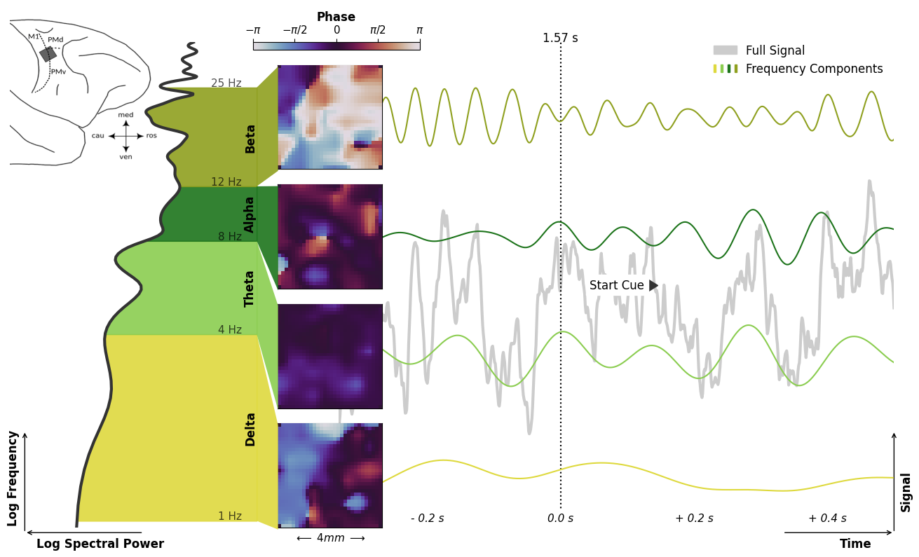
Here we go, much better. The larger, more prominent illustration of the brain and the electrode placement introduces the story of the visualization. It is overall calmer and decluttered. This is mostly due to getting rid of spines, ticks, and labels as far as possible. The frequency colors are now more similar in hue and no longer overlap with the phase color map. Because of perpendicular arrangement of time and frequency and the separation of the frequency components, the frequency colors don’t play a crucial role in the time domain anymore and are just there to slightly ease the distinction of frequency regimes.
The thing that I’m least convinced by in this visualization, are the fonts. Although I tried to keep it simply and only used two different font sizes, it feels as the fonts don’t ease into the figure but either stand out or get lost a bit. If I were to spent more time on this, I would probably play around with different other font types and letter spacing.
But all in all, I’m very happy how it turned out.
And of course as planned in the beginning, it is also animated.
Conclusion
The Dataset
The dataset used here is from an open-access data publication by Thomas Brochier, Lyuba Zehl, Yaoyao Hao, Margaux Duret, Julia Sprenger, Michael Denker, Sonja Grün & Alexa Riehle (2018). It contains neural activity that was recorded by a square electrode array in the motor cortex (as indicated in the inset image) of a macaque monkey during a hand movement task. In this task the monkey is instructed to reach for an object and to grasp it after receiving two visual cues specifying the grip type (precision grip or side grip) and the grip force (high force or low force).
The whole reason I was able to build this visualization is that this dataset was published with open-access, which is still not very common in neuroscience. Furthermore, it’s not just the pure raw data but it is fully curated and contains all information on the experiment and the preprocessing as annotated metadata. Having also such extensive metadata represented alongside the data in the data structure (here using the Neo format) is key in order to understand the details of the measurements. However, since the collection and structuring of metadata is a lot of effort, this is even less common. The extensive curation for this dataset was largely made possible by the work of Lyuba Zehl.
Interpretation
The visualization brings together the diverse aspects of the oscillatory neural activity and illustrates their interactions. It shows four different frequency regimes, their spectral power in the frequency domain, their wave-like activity across electrode array, and the signal evolution in time.
The visualization of the activity phase in space reveals spiral, circular, planar, and synchronous wave patterns. Here, it becomes apparent how distinct features of the neural activity are appearing in parallel in the different frequency regimes, not unlike separate communication channels. The power spectrum on the left hand side shows their varying contributions to the full signal. Yet, the signal time course on the right hand side shows how the signal components also align to each other, especially around behaviorally relevant events.
As reaction to the ‘Grip-Type Cue’, the Beta and Alpha components increase in spectral power and show a more synchronized activity across the electrode array.
During the actual movement, however, they are reduced in favor of Theta and Delta contributions. Whereas, there seem to be a general correlation between the spectral power and the kind of expressed wave patterns.
Such visualized relations between the aspects of the neural signals and their correlations to behavioral events may serve as a basis to guide further investigations of the functional role of brain waves.
Code Snippet Memo
The thing that took up the most time, nerves, and frankly sanity was the legend. So here, the solution for displaying multiple, differently colored markers in one legend entry:
import matplotlib as mpl  # 3.2.1
import matplotlib.pyplot as plt

colors = ['#DED93E', '#8BCD50', '#1D741B', '#8FA01F']
color_patches = [mpl.patches.Patch(color=c) for c in colors]
grey_patch = mpl.patches.Patch(color='0.8')
legend = plt.legend([grey_patch, tuple(color_patches)],
                    ['Full Signal', 'Frequency Components'],
                    handler_map={tuple: mpl.legend_handler.HandlerTuple(ndivide=None)})
Update
This visualization made the second place in the 2020 John Hunter Excellence in plotting contest.