Planning is difficult. Predicting priorities, problems, and potentials months or even years into the uncertain and ever-changing future is immensely complex. Not only do we need to forecast future conditions, but also estimate our own behavior, requirements, and efficiency, all while taking into account various known and unknown environment variables.
Thinking about it this way, it is not surprising that we as humans are notoriously bad at predicting the future and planning ahead. (Although, some seem to be systematically better than others.) The most glaring evidence for this is probably that we are, over and over again, legitimately surprised by the occurrence of events [come up with your own example here]. Furthermore, there is plenty of anecdotal and statistical evidence that a majority of projects are finished late and/or over budget. The phenomenon is well described by modern proverbs such as the Hofstadter’s Law and the 90 percent rule, as well as being scientifically approached in form of the Optimism Bias, and the Planning fallacy.
Hofstadter’s Law:
It always takes longer than you expect, even when you take into account Hofstadter’s Law.
90 percent rule:
The first 90 percent of the code accounts for the first 90 percent of the development time. The remaining 10 percent of the code accounts for the other 90 percent of the development time.
And after all, the difficulty of planning may be attested by everyone who ever procrastinated until the last minute to do something, to then did it under tremendous stress and quality trade-offs.
This is at least the line of argument with which I will start off my next PhD planning meeting. In these meetings, students are asked to map out all their projects for up to the next four years. Doing this decently accurate is ambitious at best and illusive at worst. However, that doesn’t mean that planning is useless. Quite on the contrary, it is rather the lack of planning or misplanning which causes problems down the road.
Planning time and resources wisely means to not in worrying about details which are most likely to change anyway, and prevent stepping into common mistakes such as being overly optimistic or pessimistic, misjudging our own abilities and requirements, or ignoring contradicting evidence. Any visualization used to illustrate and help with the planing should therefore be aware of the difficulties in planning workload and ideally help to avoid them.
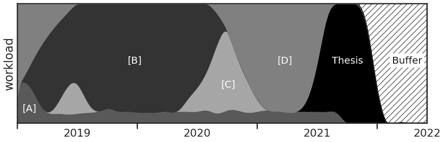
But for some reason the go-to tool to visualize workload and the temporal sequence of tasks is the Gantt chart. Even if you are not familiar with the name you have at least seen in action in some project management tool or progress reports. It is simple and straight-forward to understand. Each task ([A], [B], [C], [D]) is represented by a bar on a timeline with a clear-cut beginning and end. Multiple bars are stacked in parallel to represent different tasks or projects.
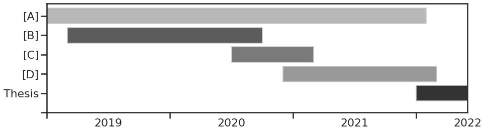
However, the Gantt chart has many shortcomings for this application. Although, simplicity is often a good attribute it can come at a cost. Here, the vertical axis is merely a categorical axis with the main purpose of separating the task bars so they won’t overlap, and even though this brings readability to the graph the vertical position has no inherent meaning. The classification could just as well be done by a legend or other annotations. Of course, categorical axes are not generally worse than ‘analog’ axes, but here it takes space away which could be used to represent additional information. And there are task properties which are arguably at least as important to the successful planning as the start and end times, for example, the relative priority of the task, the required manpower, amount of daily attention, or other resources.
Instead, the tasks are represented in binary. Either they are active or inactive. This totally obscures any uncertainty of when the task will actually start and end. Additionally, it is also not how we actually experience working on a task. Usually we don’t begin working on it continuously and steadily until it is completed. Especially, when we are involved in multiple tasks the demand and our investment may vary significantly over the duration of the task.
Naturally, within the immense catalog of plots there are alternatives which already work considerably better in these regards.
For example, the JoyPlot (also known as RidgePlot), named after the iconic album cover of Joy Divison’s ‘Unkown Pleasures’, combines the vertical categorical axis with a pseudo-dimension to represent not bars but distributions, and thus provides additional information.
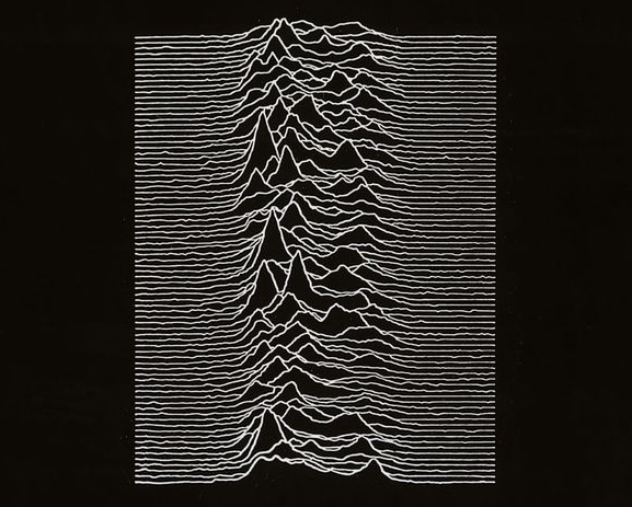
Fun fact: the plot on the original album cover shows the radio frequencies from the first discovered pulsar.
Although the Joy plot already addresses some of the shortcomings, it also doesn’t solve the biggest issue that I have with Gantt charts for visualizing workload. Having the various parallel task bars suggests that the required amount of work is dictated by the number parallel tasks. Looking at the plot naively, I might get the impression that when an ongoing task bar is joined by another task bar the plot tells me to work twice as much since I now have to work on both tasks equally. Even though nobody actually interprets it this way, this arrangement also doesn’t help avoiding the pitfall of taking up more than you can reasonably handle. A good visualization should make you aware that adding a new task will take away time from another task instead of doubling your working hours.
And this might be a wild opinion, but I believe that your workload should depend on your capacities and not on the amount of work to be done. Sure, sometimes some work is more pressing and the time spent working won’t be constant in time. However, letting your time spent working being dictated by the number of tasks ahead is a recipe for exhaustion and frustration. There is always more work ahead and you’ll get there eventually anyways. As another modern proverb nicely describes, your time doesn’t adapt to the work but the work to the available time.
Parkinson’s Law:
work expands so as to fill the time available for its completion
So, let’s give this a go. What are the objectives with which workload should be visualized for easier, more reasonable planning?
- ) The total workload is constant over time,
- ) different tasks can have different proportions,
- ) start and end times have an uncertainty,
and an extra one that is less related to the type to plot, - ) inclusion of buffer times allows for eventual delays.
Thus, for planning my PhD projects, instead of mapping out when they start and end, I rather describe the portion of time I intend spending on each one, let’s say, on a monthly basis. This data can be comfortably written as a pandas.DataFrame or numpy.ndarray.
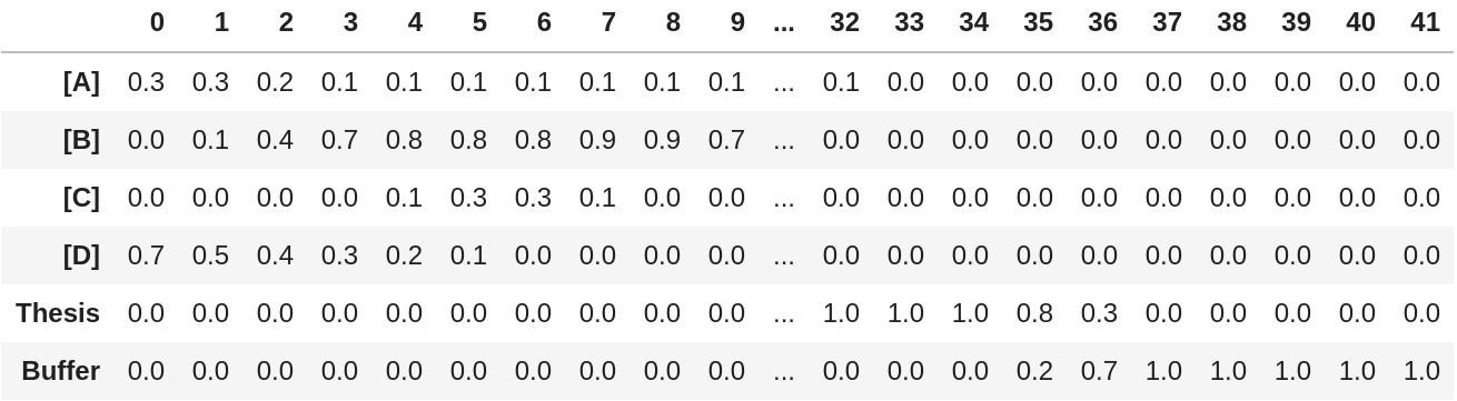
To compare the information content, if I would transform the matrix now to a simple boolean matrix I would arrive again at a Gantt chart, with the horizontal axis (matrix columns) being the time axis and the vertical axis (matrix rows) being the categorical project axis. But here, I want to use the additional information in a way that the estimated workload partitions are being represented on the vertical axis.
Because I didn’t check that the partitions each month actually sum up to 1, the first thing the plotting function does is to apply objective a) and normalize each column by its sum. Next, the relative workload partitions for the projects which are defined in the matrix rows need to be arranged vertically. This is very simply done by just stacking them on top of each other so that the entire plot if filled with different areas for the projects. Doing a cumulative sum over the rows returns the functions describing the borders between the areas.
For now, these functions have a resolution of one month, which can look a bit clunky. I like to represent the border functions in a more smooth and continuous way, because it is more visually pleasing but also because it gives a better impression of the uncertainty around the given partition values. Thus, the plotting function interpolates the data with a resolution of N points using the scipy.interpolate.interp1d() function. I find a 'cubic' interpolation is a good default, however, in case the data would be better represented by a step function this can be replaced by 'nearest' or 'previous'.
To further address objective c), the plotting function also provides an optional smoothing of the functions via a kernel convolution with width sigma in units of the matrix columns (so here months).
And that is basically it. The full code for the PartitionPlot can be found below.
There it is, in this alternative for visualizing workload I can now see immediately the extend of each project and can anticipate on which project I plan to focus at which point in time, while not hiding any inherent planning uncertainty, and of course accounting for delays by including a buffer.
# Python 3.8.0
import matplotlib.pyplot as plt  # 3.1.2
import seaborn as sns  # 0.9.0
import pandas as pd  # 0.25.3
import numpy as np  # 1.17.4
import scipy as sc  # 1.3.2

def partition_plot(partitions, xvalues=None, colors=None, kind='cubic', N=200,
                   sigma=1.0, pad=0, ax=None):
    """
    Visualizes partitions over time.

    Parameters
    ----------
    partitions : pands.DataFrame or np.ndarray
        The first axis (rows) is interpreted as the catergories,
        the second axis (columns) is interpreted as a time axis.
    xvalues : np.ndarray (default: None)
        Array of time points for the given partitions. Must be of same length
        as the partition columns.
        If partitions is a DataFrame xvalues are set the columns.
    colors : list (default: None)
        List of colors to fill the partion areas. Must be of same length as
        partitions. If None uses the current color palette.
    kind : str (default: 'cubic')
        Interpolation parameter passed to scipy.interpolate.interp1d()
    N : int (default: 200)
        Number of points to use to draw the interpolated functions.
    sigma : float (default: 1.0)
        Width of kernel used to smooth the interpolated functions in units
        of input partition columns.
    pad : int (default: 0)
        While calculating the partition border functions pad temporarily adds
        x columns with a uniform partition distribution to the left and right
        side of the partition matrix in order to eliminate eventual border
        artefacts.
    ax : matplotlib axis (default: None)
        Axis to draw in the plot. If None, creates a new figure.

    Returns
    -------
    curves : np.ndarray
        Interpolated partition border curves, with shape len(partitions) x N.
    """
    if isinstance(partitions, pd.DataFrame):
        xvalues = partitions.columns.to_numpy()
        labels = partitions.index.to_list()
        partitions = partitions.to_numpy()
    else:
        labels = np.arange(len(partitions))

    Npartitions, Npoints = partitions.shape

    if xvalues is None:
        xvalues = np.arange(Npoints)
    elif not len(xvalues) == Npoints:
        raise Warning('Array of xvalues is not of the correct length!')

    if colors is None:
        colors = sns.color_palette()
    elif not len(colors) == Npartitions:
        raise Warning('List of colors is not of the correct length!')

    if pad:
        partitions = np.concatenate((np.ones((Npartitions,pad)),
                                     partitions,
                                     np.ones((Npartitions,pad))), axis=1)
        xvalues = np.concatenate((np.arange(xvalues[0]-pad,xvalues[0]),
                                  xvalues,
                                  np.arange(xvalues[-1]+1, xvalues[-1]+1+pad)))

    partitions /= np.sum(partitions, axis=0)[np.newaxis, :]
    y = np.cumsum(partitions[:-1], axis=0)
    f = sc.interpolate.interp1d(xvalues, y, kind=kind, axis=1)
    x = np.linspace(xvalues[0], xvalues[-1], N)

    curves = np.concatenate((np.zeros(N)[np.newaxis,:],
                             f(x).clip(0,1),
                             np.ones(N)[np.newaxis,:]),
                            axis=0)

    if sigma:
        s = sigma/Npoints * (N+2*pad)
        win = sc.signal.hann(int(np.rint(s)))
        for i, curve in enumerate(curves[1:-2]):
            curves[i+1] = sc.signal.convolve(curve, win, mode='same')\
                        / sum(win)

    if ax is None:
       fig, ax = plt.subplots()

    for i, curve in enumerate(curves[:-1]):
        if pad:
            ax.fill_between(x[pad:-pad], curve[pad:-pad], 1,
                            color=colors[i], label=label[i])
        else:
            ax.fill_between(x, curve, 1., color=colors[i], label=i)

    ax.set_ylim((0,1))
    if pad:
        return curves[:, pad:-pad]
    else:
        return curves
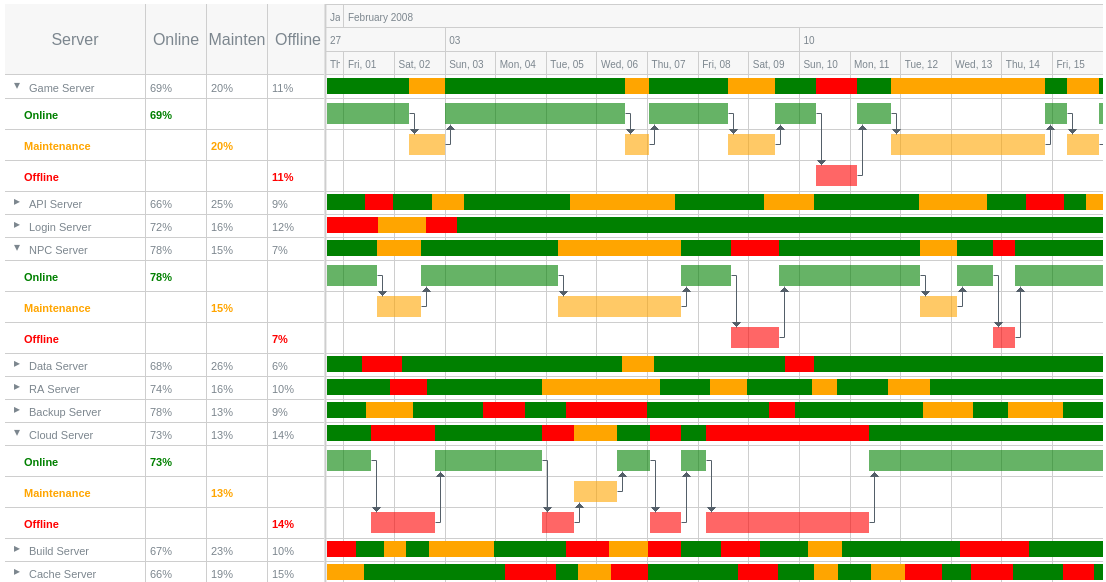
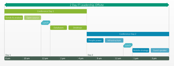
Finally, to not let this post be a pure Gantt rant, here are some excellent examples of Gantt charts being used appropriately.